Sunday, July 17, 2011
DEM
DEM are digital elevation models. These are computer produced maps that show elevation of the surface. May of these maps use color shading to show the relief. The particular DEM map shows elevation in a location in Africa. http://www.satimagingcorp.com/svc/dem.html
DOQQ
DOQQ’s are digital aerial photos. They can be produced as false color-infrared photos or in true color. The image above is a false color infrared. False color imagery helps delineate surface features.http://www.lib.ncsu.edu/gis/doqq.html
Isopleths
Isopleth maps makes the information portrayed on the map easy to view by using lines of connecting data points. These maps consist of contour maps and meteorology maps. The big thing on these maps is showing the third dimension. This Isopleth map is showing horizontal temperature difference. http://www.google.com/imgres?imgurl=http://cimms.ou.edu/~doswell/sfcanal/Fig_5c.GIF&imgrefurl=http://cimms.ou.edu/~doswell/sfcanal/surface_analysis.html&usg=__MDc9amDlcG-nvedhJW3T-6OLRhM=&h=462&w=608&sz=17&hl=en&start=0&zoom=1&tbnid=Fk_3G0l9yINhqM:&tbnh=98&tbnw=129&ei=Lp8jTouGIs3ogQfngcW-Cw&prev=/search%3Fq%3DIsopleths%26um%3D1%26hl%3Den%26sa%3DN%26biw%3D935%26bih%3D551%26tbm%3Disch&um=1&itbs=1&iact=hc&vpx=373&vpy=246&dur=2565&hovh=196&hovw=258&tx=186&ty=89&page=1&ndsp=15&ved=1t:429,r:7,s:0
Star plots
Star plots let the viewer compare multiple variables for each observation. They are so common because they allow for easy visualization. In this star plot it shows the different automobiles in 1979 and give an analysis of each of them based on price, mileage, repair, headroom, etc. http://www.itl.nist.gov/div898/handbook/eda/section3/starplot.htm
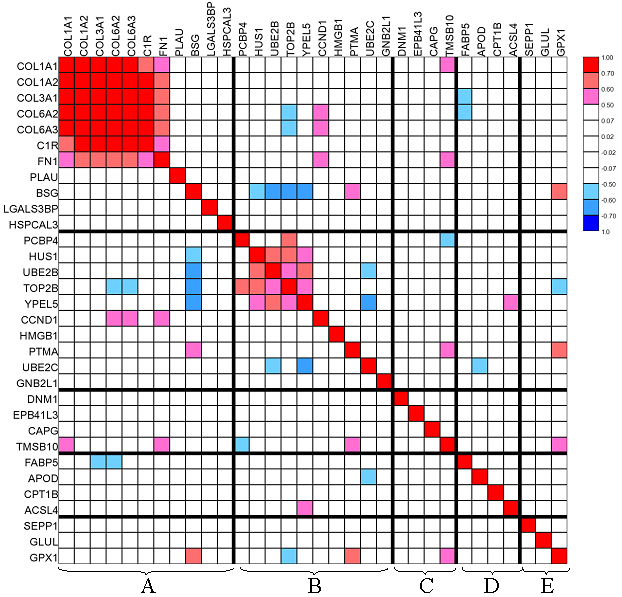
Correlation matrix
This Correlation matrix is showing a subset of the top 100 cancer genes. These charts show a correlation between the different genes.http://www.google.com/imgres?imgurl=http://www.livestockgenomics.csiro.au/Genome_to_Phenome/matrix32_blocked.png&imgrefurl=http://www.livestockgenomics.csiro.au/Genome_to_Phenome/&usg=__Yfd_2_IeD8SayFb7gH7f48l9Nl4=&h=597&w=622&sz=82&hl=en&start=0&zoom=1&tbnid=5QQiOkveFfGYEM:&tbnh=121&tbnw=126&ei=iJwjTv21I5HogQeo-eC-Cw&prev=/search%3Fq%3DCorrelation%2Bmatrix%26um%3D1%26hl%3Den%26biw%3D935%26bih%3D551%26tbm%3Disch&um=1&itbs=1&iact=rc&dur=351&page=1&ndsp=12&ved=1t:429,r:2,s:0&tx=47&ty=74
Similarity matrix
Similarity matrix's show how a variable changes between different variations of it, such as genes. In the above chart, it shows Amino Acids similarities. http://cbrg.ethz.ch/Server/ServerBooklet/section2_14.html
Stem and Leaf Plot
Stem and Leaf Plots are designed with the tenths number on one axis and the singles digit plotted in the chart. This makes finding the median fairly easy for the viewer. They also help show alot of data in a small area. http://www.eduplace.com/math/mhm/5/06a/index.html
Box plot
"A boxplot, or box and whisker diagram, provides a simple graphical summary of a set of
data. It shows a measure of central location (the median), the average, and measures of dispersion. Boxplots are especially useful when comparing two or more sets of data."(Notes)
So in this data set, it shows the median score of each machine as well as each percentile. http://itl.nist.gov/div898/handbook/eda/section3/boxplot.htm
Histogram
A Histogram is a chart that displays a tabulated frequency. That means that it will show the number of times another data set was selected. So in the chart above, 6 scored a number of 50. http://www.netmba.com/statistics/histogram/
Parallel coordinate graph
Parallel coordinate graphs are made to show large amounts of information. They are not meant to indicate change as much as to get a lot of data into one graph. Each variable is graphed on a vertical axis. A data element is plotted as a connected set of points. http://www.stat.columbia.edu/~cook/movabletype/archives/2007/10/parallel_coordi.html
Triangular plot
Triangular plots are designed to get the percents of sand, silt and clay out of a certain area. It tells the viewer what percent of each soil type makes up the other soil types. http://www.uwsp.edu/geo/faculty/ritter/glossary/s_u/soil_texture_triangle.html
Windrose
A Windrose map shows the direction the wind blew from most of the year. In this map the wind blew from the North less than 2% of the time. http://www.mathworks.com/matlabcentral/fileexchange/17748-windrose
Climograph
A climograph is a graphic representation of the relation between temperature and
precipitation as plotted at monthly intervals throughout the year. This graph above is showing that the rainfall is down and the temperature is up, causing the drought conditions. http://www.drought.unl.edu/whatis/climographs.htm
Population profile
Population profile or population pyramids as many people call them are graphs that display age and sex distributions for a given region. Depending on the shape of the graph, one can tell if the population is increasing, decreasing, or remaining constant. This map shows a large group of young people and a small group of elderly. http://www.scalloway.org.uk/popu4.htm
Scatterplot
Scatterplot is a graph charted with the actual values. There is them a trend line placed on the graph. By looking at the patter of the dots you can tell what kind of trend the data is following. http://www.google.com/imgres?imgurl=http://www.meted.ucar.edu/hydro/verification/intro/media/graphics/scatterplot_question.gif&imgrefurl=http://www.meted.ucar.edu/hydro/verification/intro/print_version/04-Correlation.htm&usg=__gn7RTlXgzQUD70jB9IKL25Hvo4M=&h=400&w=550&sz=6&hl=en&start=14&zoom=1&tbnid=L9z55fA6T6NooM:&tbnh=115&tbnw=158&ei=RpIjTsCJN5LqgQfS3Mm-Cw&prev=/search%3Fq%3Dscatterplot%26um%3D1%26hl%3Den%26sa%3DN%26biw%3D935%26bih%3D551%26tbm%3Disch&um=1&itbs=1&iact=rc&dur=495&page=2&ndsp=13&ved=1t:429,r:9,s:14&tx=66&ty=53
Index value plot
Index value plots are made up of index values rather than an absolute number. In this chart above the index value is 50. http://www.muhlenkamp.com/investment/principles/the_frugal_consumer-will_it_last
Accumulative line graph or Lorenz curve
Accumulative line graph or Lorenz curve shows a graph that has two lines. One line will be the actual data and it is known as the Lorenz Curve. This line shows actual data while the other shows the information if it were equally distributed. http://www.nature.com/bmt/journal/v34/n10/full/1704653a.html
Bilateral graph
Bilateral graphs are graphs that show one thing on either ends of the scale. For example, their will be an natural increase on one side and a natural decrease on the other. One being birth rates and the other being death rates. http://www.emeraldinsight.com/books.htm?issn=1574-8715&volume=9&chapterid=1912022&show=html
Nominal area choropleth map
Nominal area choropleth maps uses nominal data to show the results of the research. The information that is displayed is strictly random and has no set standards. http://www.babynamewizard.com/node/27109
Unstandardized choropleth maps
Unstandardized choropleth maps show the raw numbers and have no sort of range or standard that they are adjusted to. This map for example does not have a set range. http://blog.revolutionanalytics.com/2009/11/choropleth-map-r-challenge.html
Subscribe to:
Posts (Atom)